Are you looking to decorate and create a cohesive party theme in a restaurant setting where it’s decor is fighting for attention? Don’t know where to start? Well let’s keep it simple and start with finding a design or theme you like. Then we will look at where to focus your efforts decorating and incorporating this theme.
I usually start with something that has taken my “fancy” (or my client’s “fancy”) or if it is a theme such as “tropical” I would pick one or two things that mean tropical to me and go from there rather than getting overwhelmed by so many different tropical ideas.
Now many things take my fancy I have to admit! But usually it’s just one or two items that inspire the design for party. It can be the graphic I’ve seen on an invitation, a swatch of fabric, a fruit, a flamingo (!), a cake stand, an animal or another cute prop I’ve found (& just have to have). Color is pretty much always the other factor!
The key to me is finding that thing (or things) you love and weaving it into other key elements of your party – i.e. the graphic design, the dessert table (desserts, linen, backdrop), the flowers, table settings and the favors. These are the key things guests will focus on when they arrive, during the event and when they go to leave.
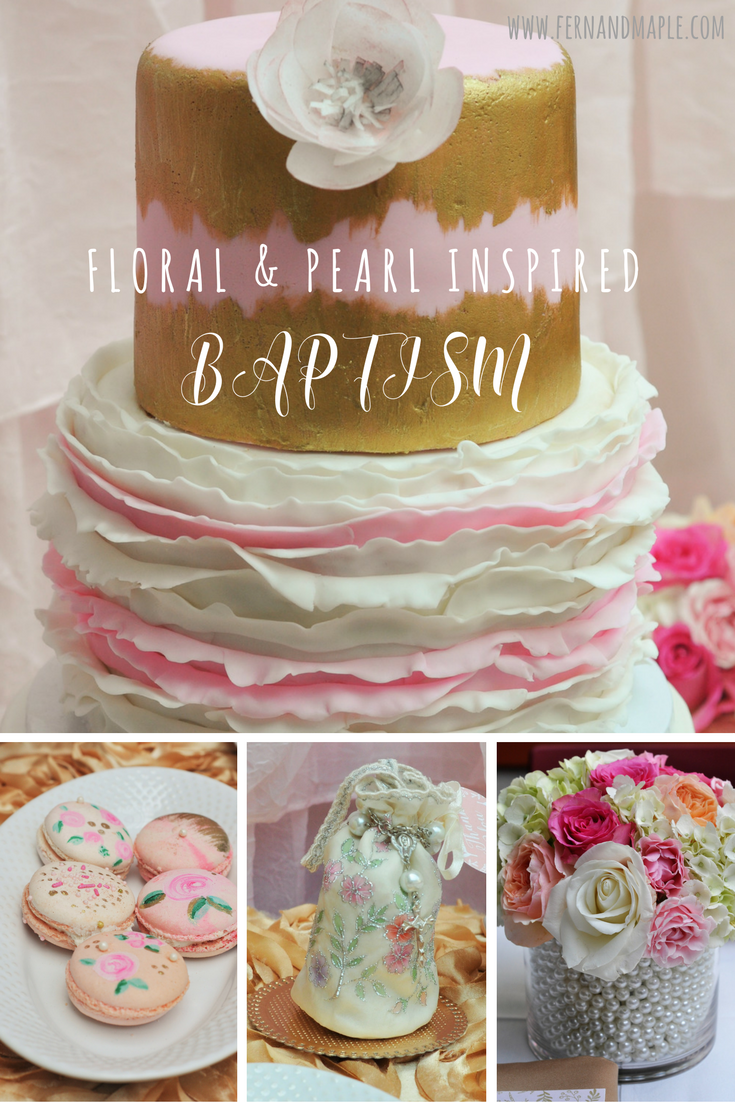
It doesn’t have to be super expensive. This baptism was not a large budget party but we were able to choose things that would give the most visual impact in these areas and capture the theme.
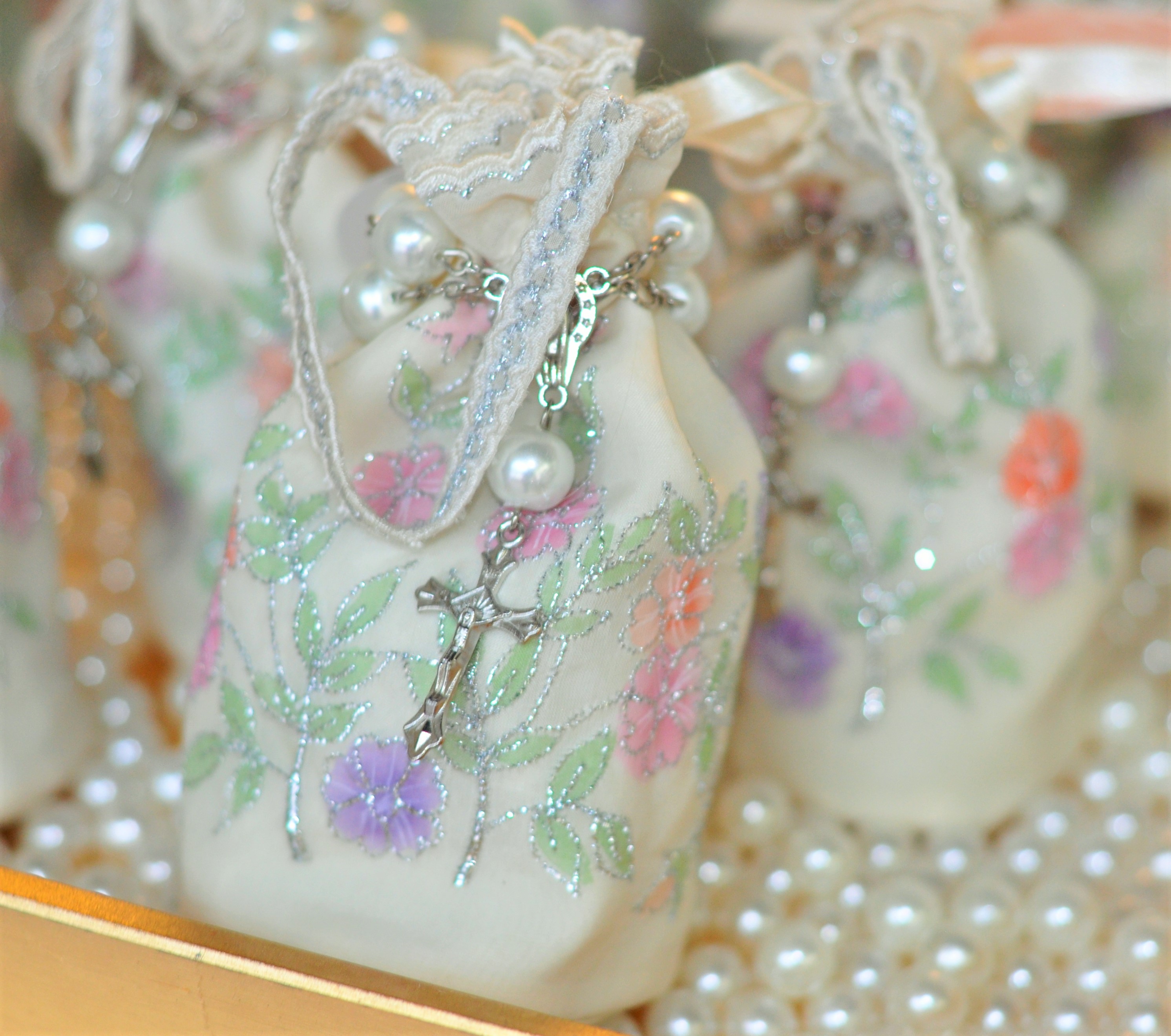
When I was designing this baptism that “inspiration” came from both these gorgeous favor bags and classic pearl rosaries. I’m going to show you how I combined these things, along with Taline’s main color selection of soft pink & gold, inspired the party details.
The Inspiration:
Once Taline, Claire’s mother, saw these hand painted silk favor pouches she was sold. Me too! I had never used Bellenza before and I was really happy with the quality of these pouches. They were even fully lined! The flowers, the leaves and foliage in the design were perfect.
I purchased the rosary bracelets off an etsy seller. There were so many to choose from but the quality and subtle design of these ones stood out.
Both coordinated well together and made a great base inspiration for the baptism. The fact that both had silver accents not gold wasn’t an issue – they contrasted nicely and brightened the look. Don’t be afraid to bring in other colors or elements…try them out against the other items you are using to see if they work. I usually mock up a party at home well before the actual party and I was able to have Bellenza sent me a sample to try out before I made my purchase.
The Graphic Design:
Graphic printables are a great place to start with creating a cohesive design and it is a cost effective method. A printable is a digital file that is either downloaded directly or emailed to you. Etsy is full of gorgeous designs you can purchase and have personalized for your event. Or alternatively you can work directly with a designer like I did and create a “custom” design just for you. You can use your file to print at home or at your local office supply store.
Graphic printables can be used to make banners, backdrops, food tents, water bottle labels, menus, favor tags and a whole range of fun signage. So you’re only limited by your own imagination. You can incorporate in so many places and take up space or cover up unsightly things in the process!
Ashtyn, the designer behind Plum Box Press, used both the color palette and the delicate leaves & foliage on the favor bags to create a beautiful custom design for me that could be used across all of the party printables. She paired it with a gorgeous script font and a simple gold cross. Very elegant.
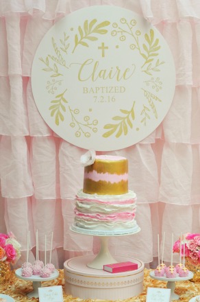
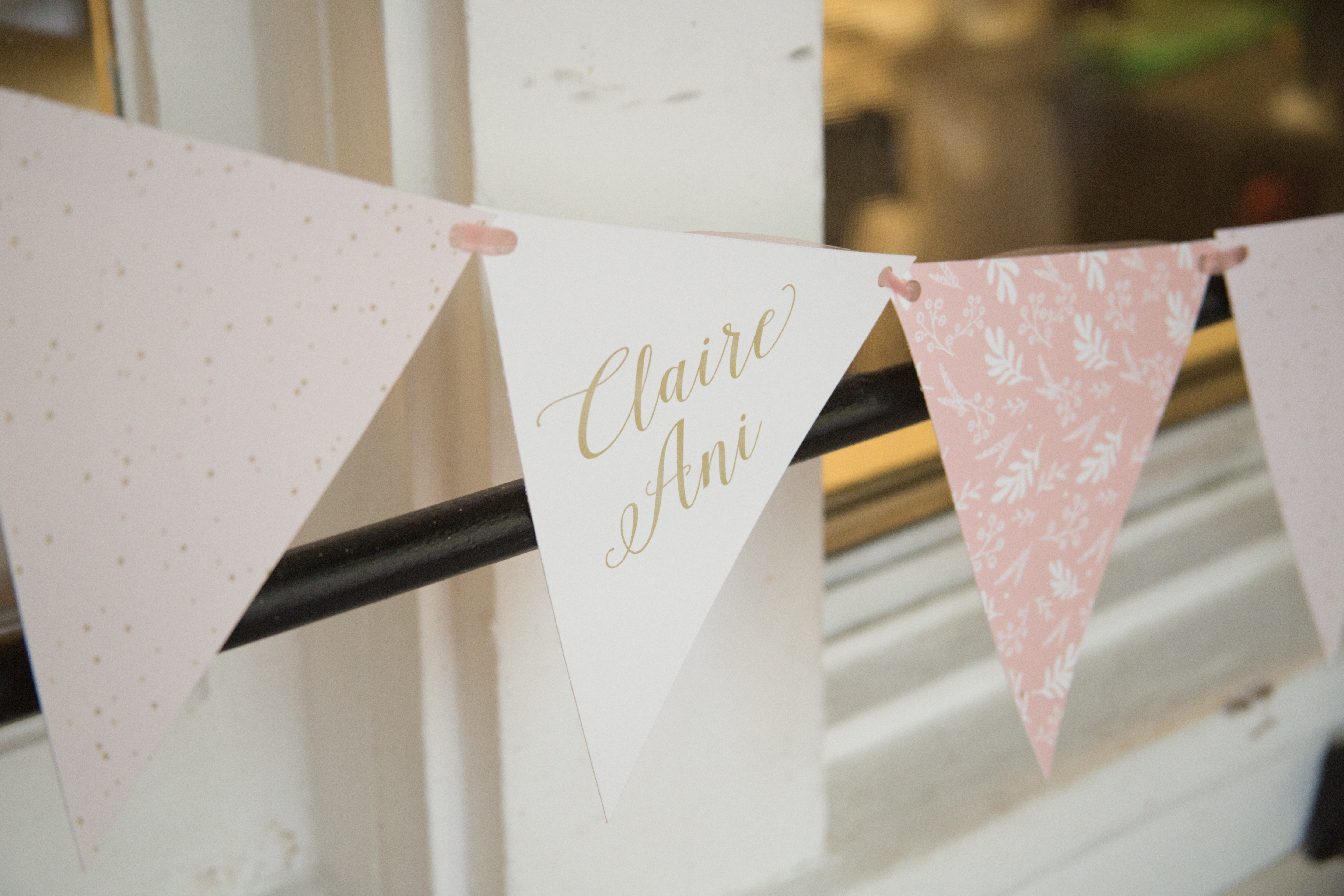
The first place I incorporated the design was in the backdrop, Ashtyn designed a simple circle using the foliage with Claire’s name and date of baptism. I kept it simple with a pale pink fabric backdrop (2 curtains! on a photo backdrop frame) so it would stand out and represent the baptism.
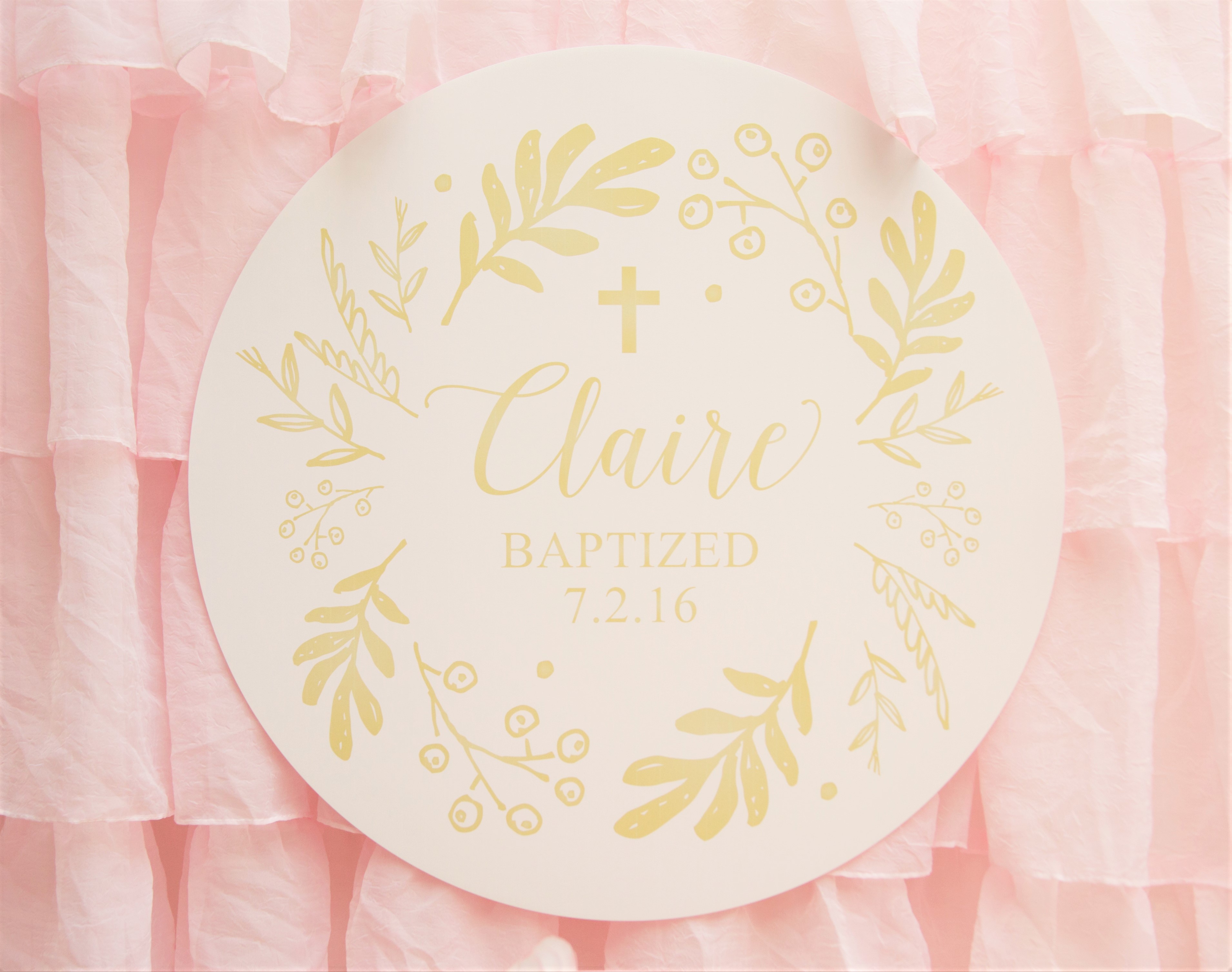
There was no way I was cutting this by hand! I took it to the printer and they were able to have it contour cut using a computer. From there it is easy to attach (suspend), I used ribbon taped to the back, looped over the backdrop frame and pinned back onto itself behind the circle.
This covered an entire corner of the restaurant that had mural of an Italian scene!From there the design was used in various forms (circular, a simple punctuation above a word, or as a border) throughout other areas of the baptism. For example, signage and banners, all eye catching.
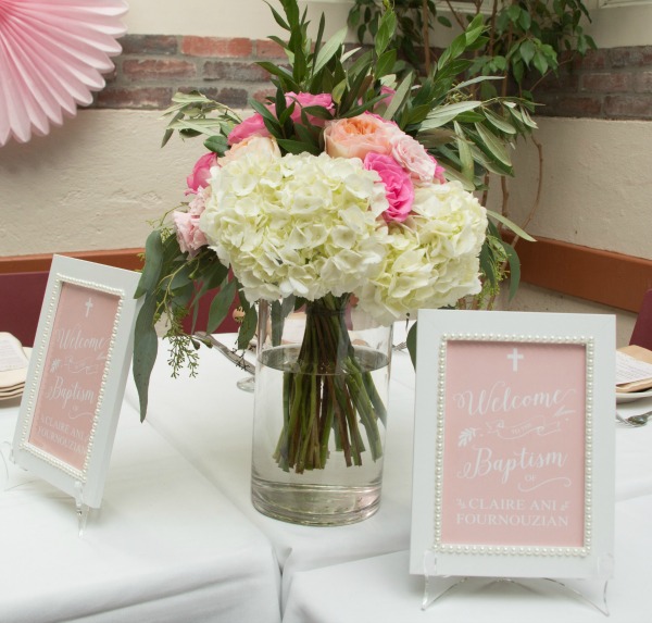
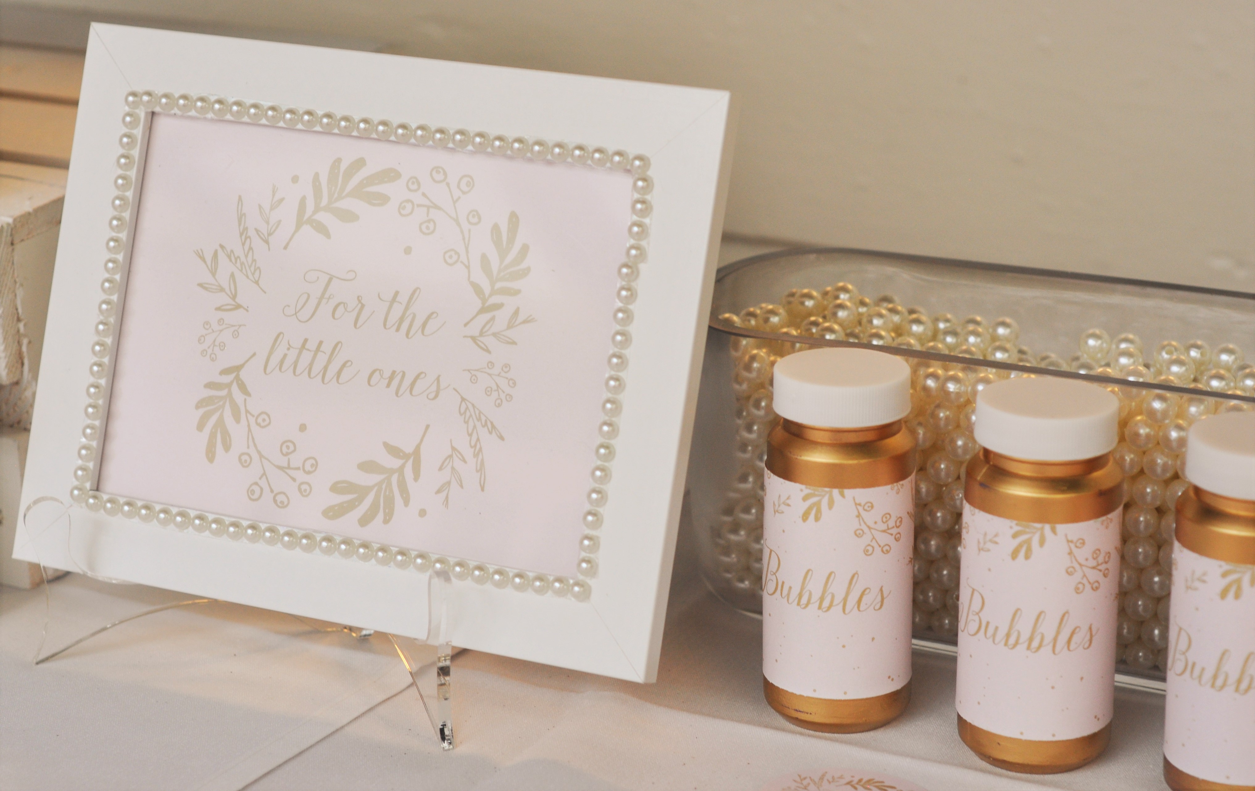
To further emphasis the theme I used simple white frames for signage and added pearls to the frames. I used adhesive pearls – the pearl is split in half and the flat back is adhesive. The great thing about these is they can easily be removed and reused after the party.
The Desserts:
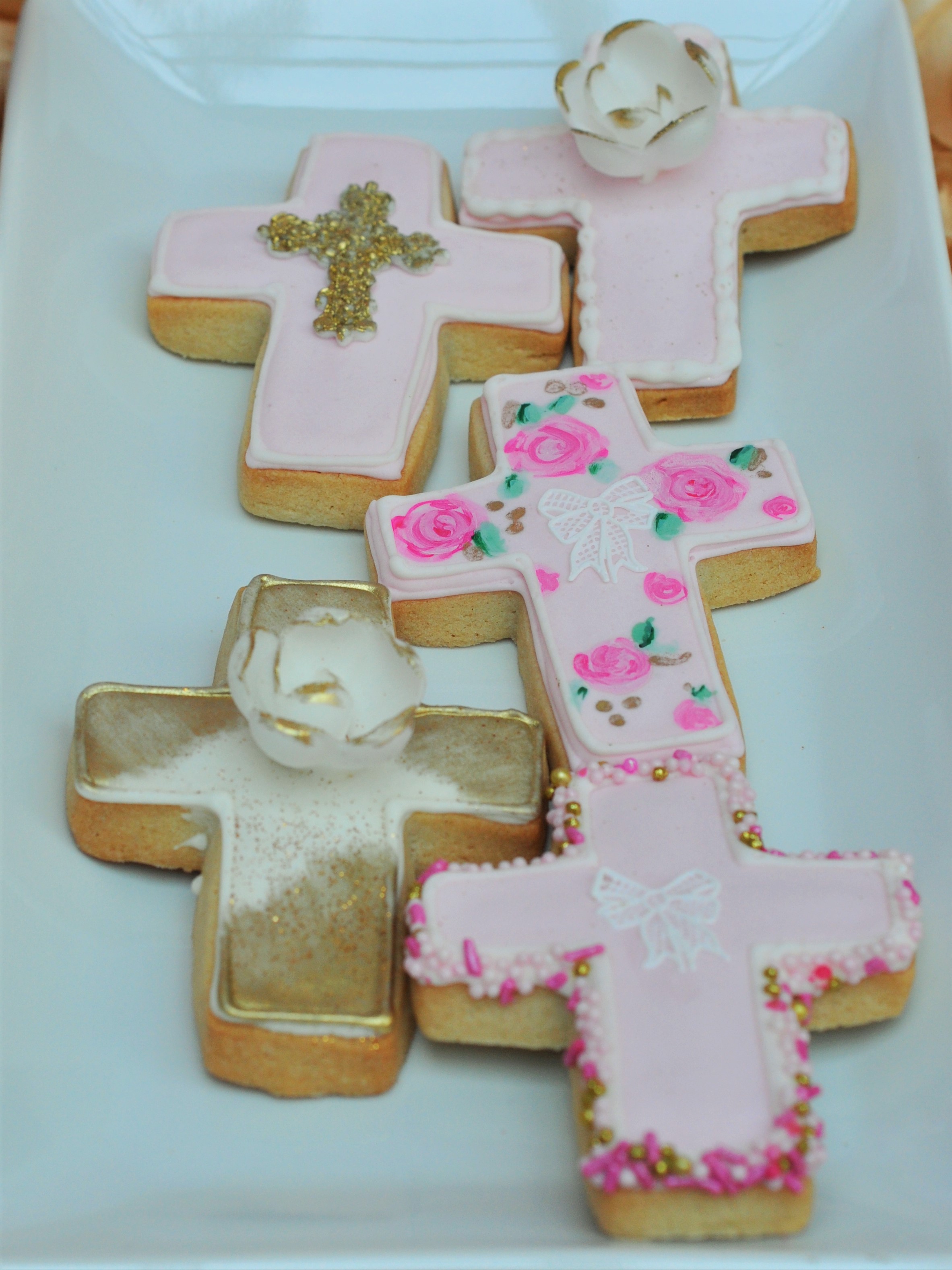
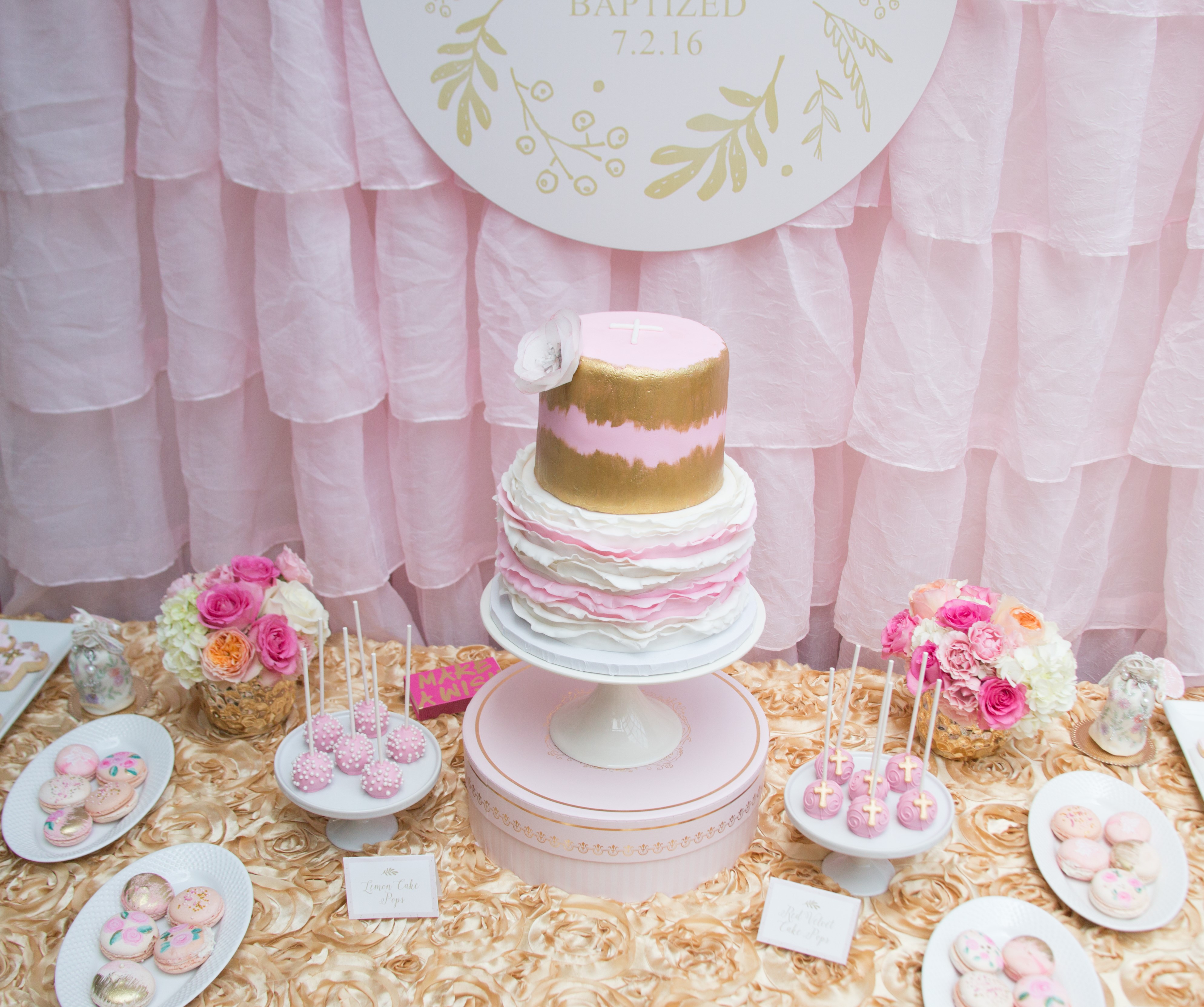
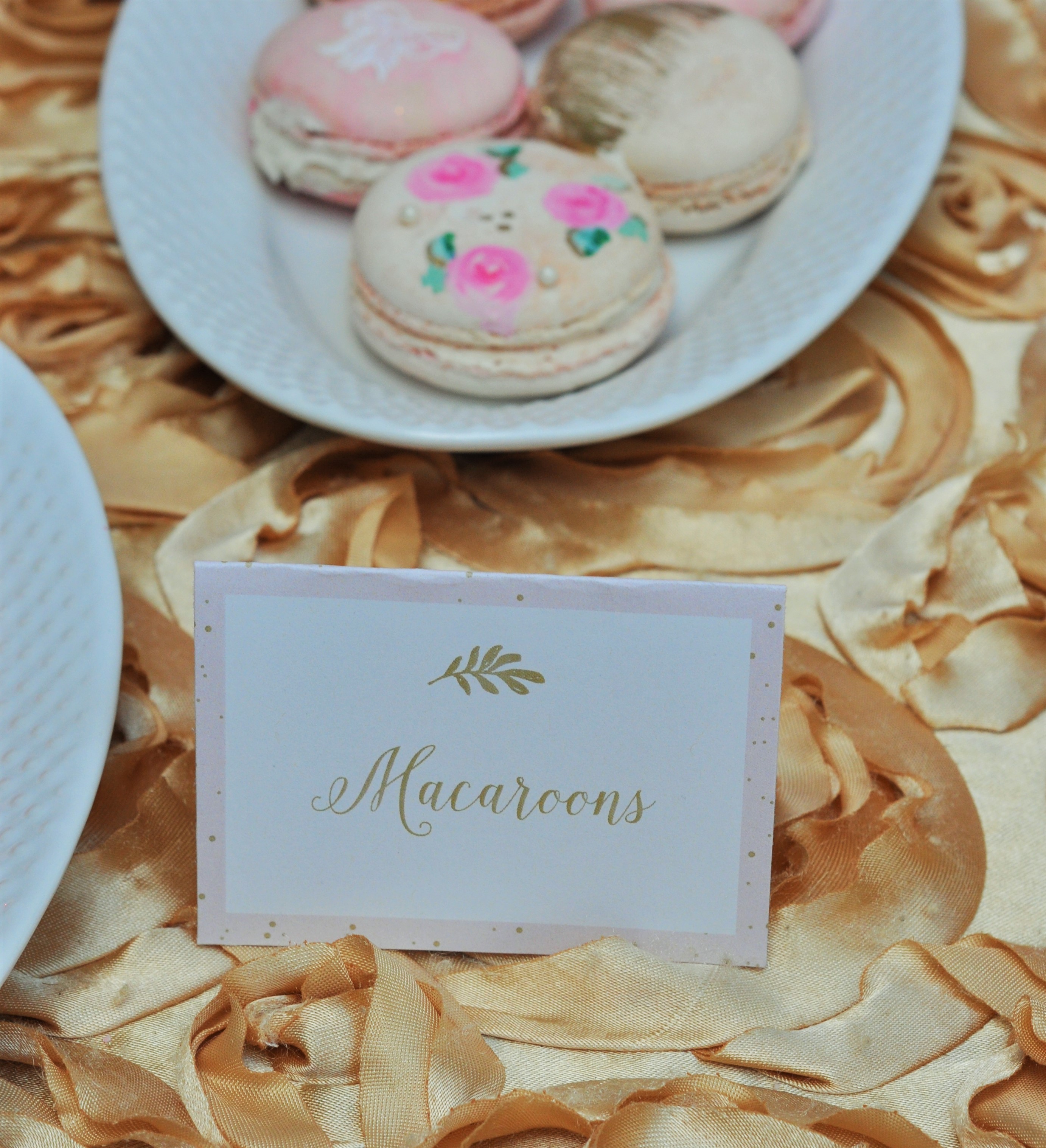
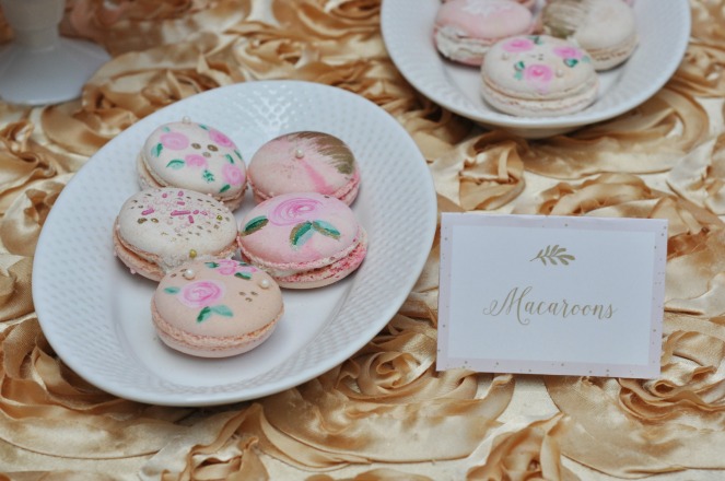
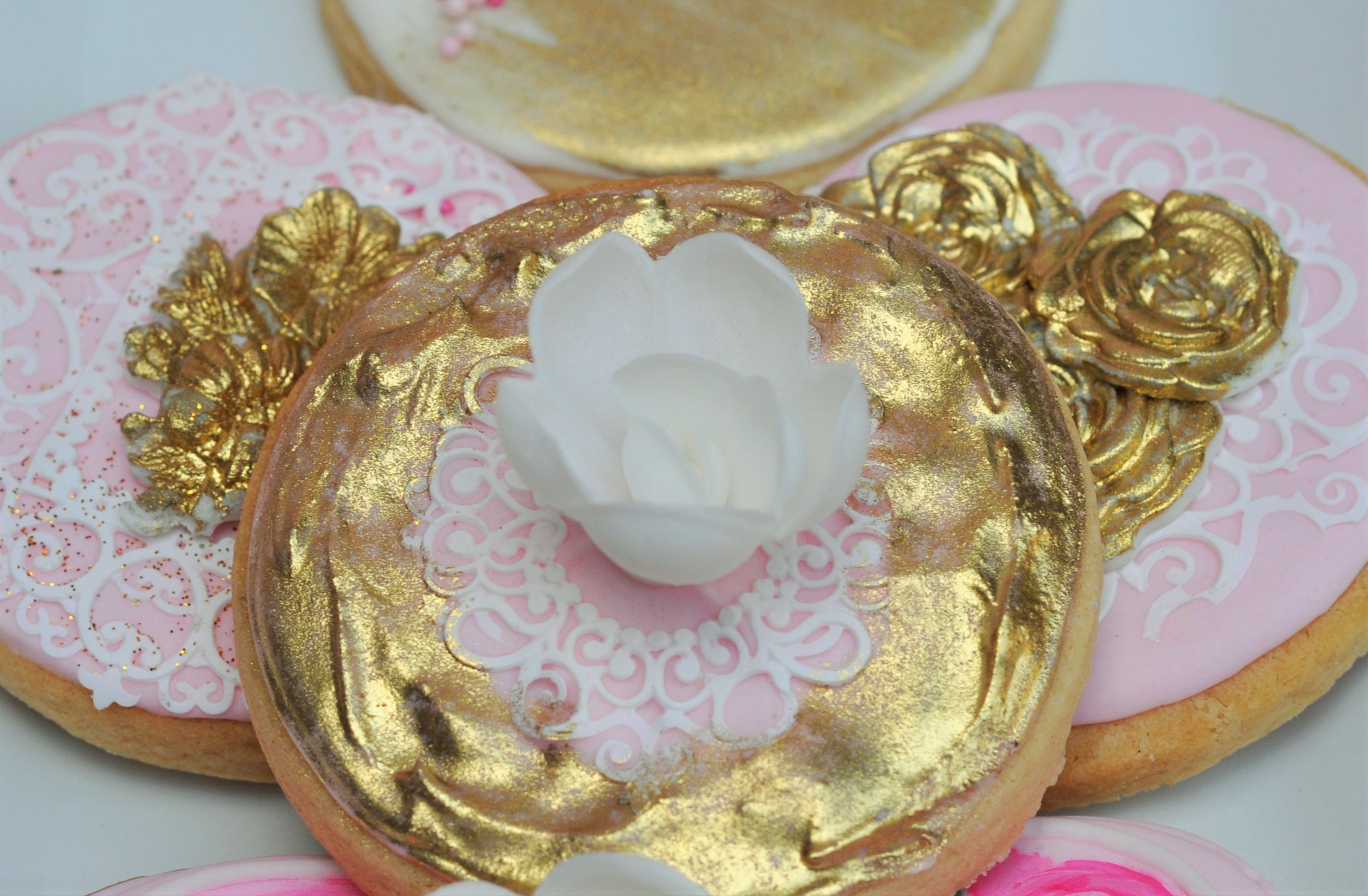
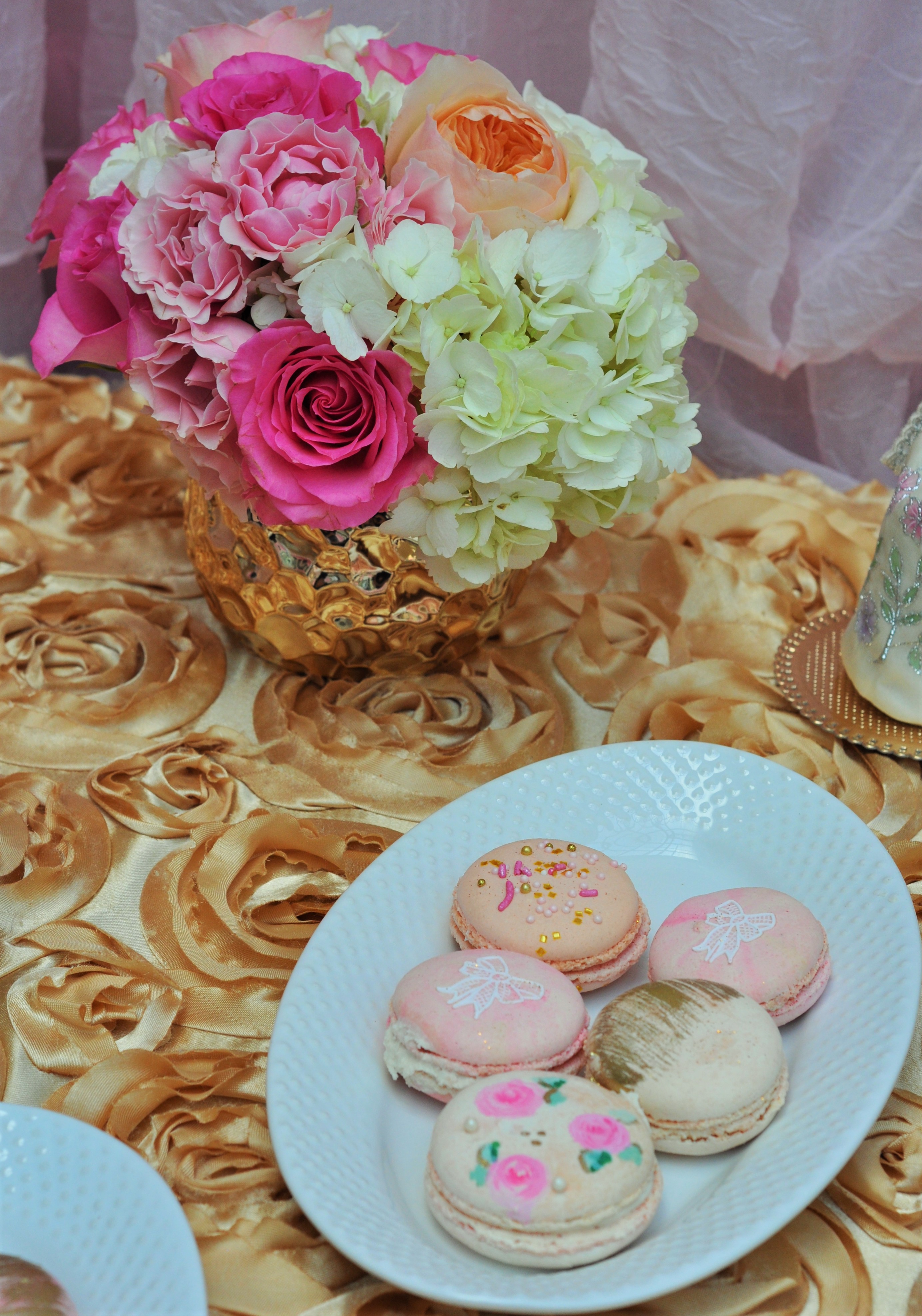
As I mentioned, the dessert table is a focal point and this means people will gather around it and look at that rather than things you’d prefer they didn’t notice. So I wanted impact and I wanted to use desserts that the theme could be incorporated into via decoration. For example hand painted flowers, delicate 3D flowers and pearls. For the hand painting concept I wanted to have a watercolor feel, that keeps the design current. So any gold would also have a painted and blended feel.
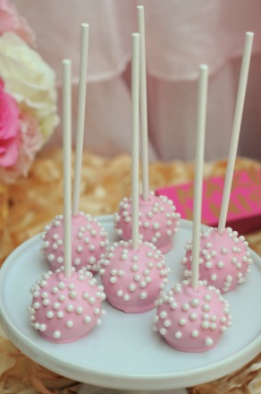
I’ve worked with both Roni (macaroons & cookies) and Sara (cake pops) many times before and they never disappoint. For this baptism Roni hand painted each cookie and macaroon! There are delicate layers of white icing that look like the stitching on the pouch, edible flowers and tiny edible pearls. While Sarah carefully added mini pearls and crosses to each cake pop. The results are gorgeous and were definitely a talking focal point.
The Cake:
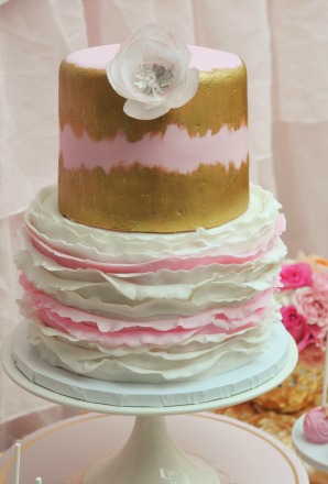
The centerpiece to end all centerpieces! This gorgeous beauty was created by Red Flour Co out of LA and just captured the palette, the florals and the delicate ruffle of the drawstring pouch. It really speaks for itself, I’m truly amazed by dessert decorators, so talented.
I kept the backdrop simple for this so as not to distract from the cake. I also elevated it so it would be the main focal point and kept the other desserts low. This cake did it’s job and then some.
Focal Point
The Flowers:
I love fresh flowers at an event. They can be used in so many ways to incorporate your theme, from the flower selection to the arrangement and even the vase used. More importantly they instantly dress up a venue, giving it that special feeling that something important is going on.
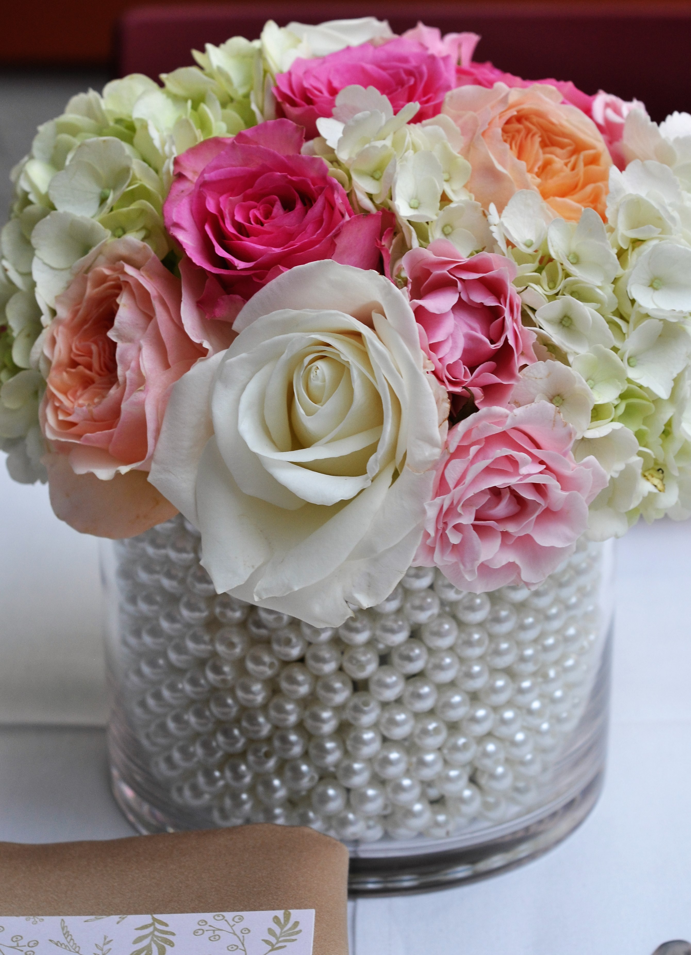
For the baptism I wanted to bring in the pearls again, filling the table vases with pearls and having the flowers emerge from the center. Susan, the owner of Bloomin Couture did a beautiful job of this. She used an internal vase which the flowers were put into and then the pearls were used to fill the space between the external and internal vase.
We stuck to flowers within the color scheme, soft and feminine. A range so that they looked like a watercolor and some green shoots to reference the graphic design. The vases on the dessert table were a simple gold.
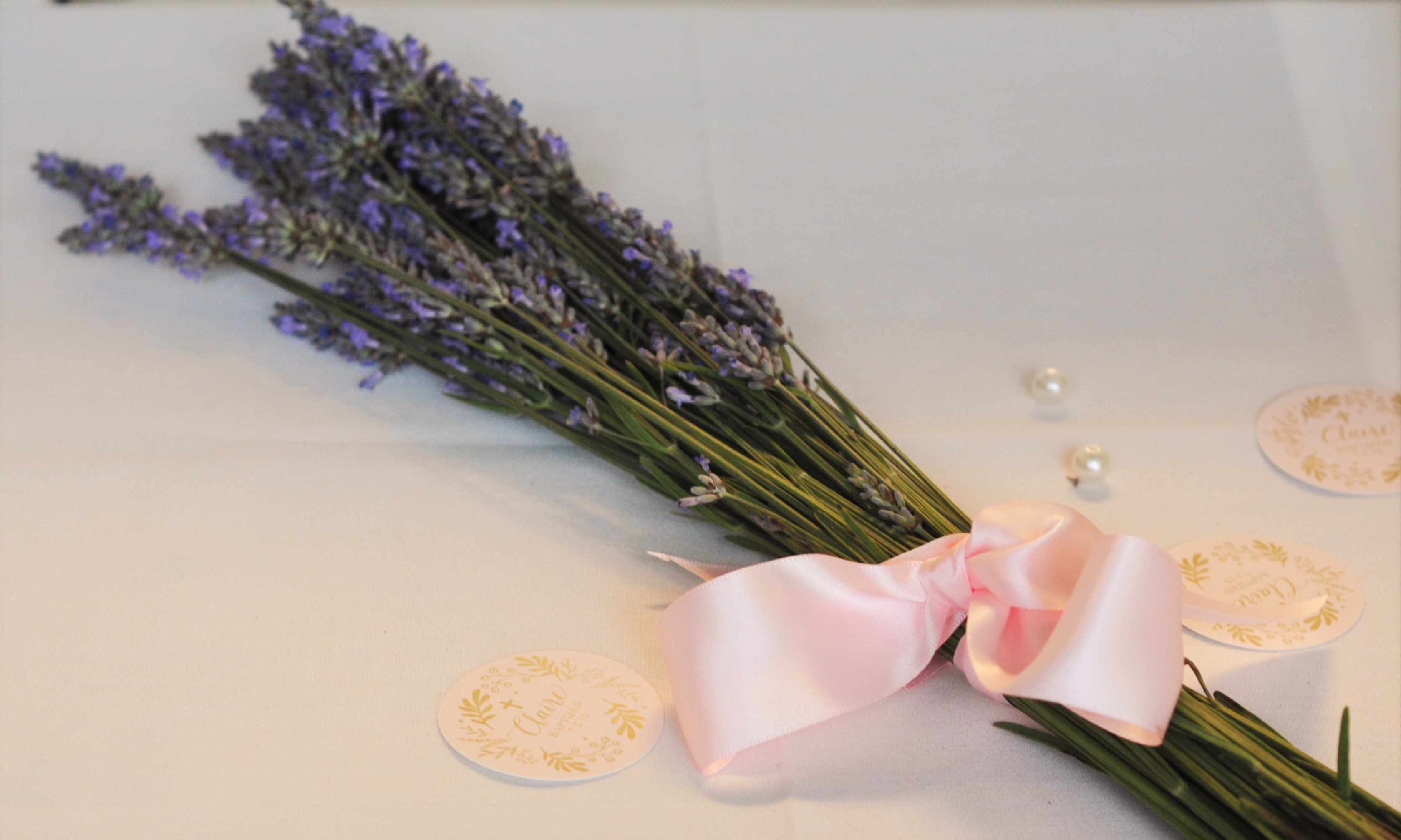
One last touch was including 2 small hand tied bunches of fresh lavender. These were with the lavender filled favor pouches and the smell was gorgeous! Scent and sight, tick!
The Favors:
The restaurant had a small table that many guests would be looking at over dinner. Without anything there it really didn’t look very pretty, guests were staring at an unattractive wall. So this is where I created a favor table.
Cue signage, flowers and the pouches themselves, which were gorgeous and added some excitement to this corner of the patio. The pouches were used for their original purpose, filled with sweet smelling dried lavender and then although they had ties, I used the rosaries as a second tie These were an elegant keepsake for the women attending the baptism celebration. I also displayed a few on the tables themselves. Another easy way to decorate.
I used a gold tray for display, the bottom of which was lined with loose pearls, this incorporated both the gold and the pearl theme. Finally the graphic design was layered in via signage and the favor tag.
For the men, a small gold favor box tied with a pink ribbon and filled with almonds. A traditional baptism favor. Again I used the tray & pearl combination with signage identifying these as favors for the gentlemen.
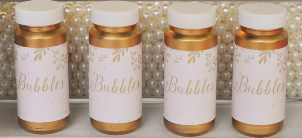
There were several young children at the baptism, for them I spray painted bottles of bubbles gold (remove the original label & then spray). I then added a custom label created by Plum Box Express. A large vase of pearls sat behind the pearls…mental note if you put a sign saying “for the little ones” tell guests they are not sweets! The children were fine it was the men who tried! LOL
Using the things provided by the venue:
The final touches. We had a small set-up time prior to this event It is a working restaurant so has sittings to take into consideration. This meant things had to be quick to add and quick to take away.
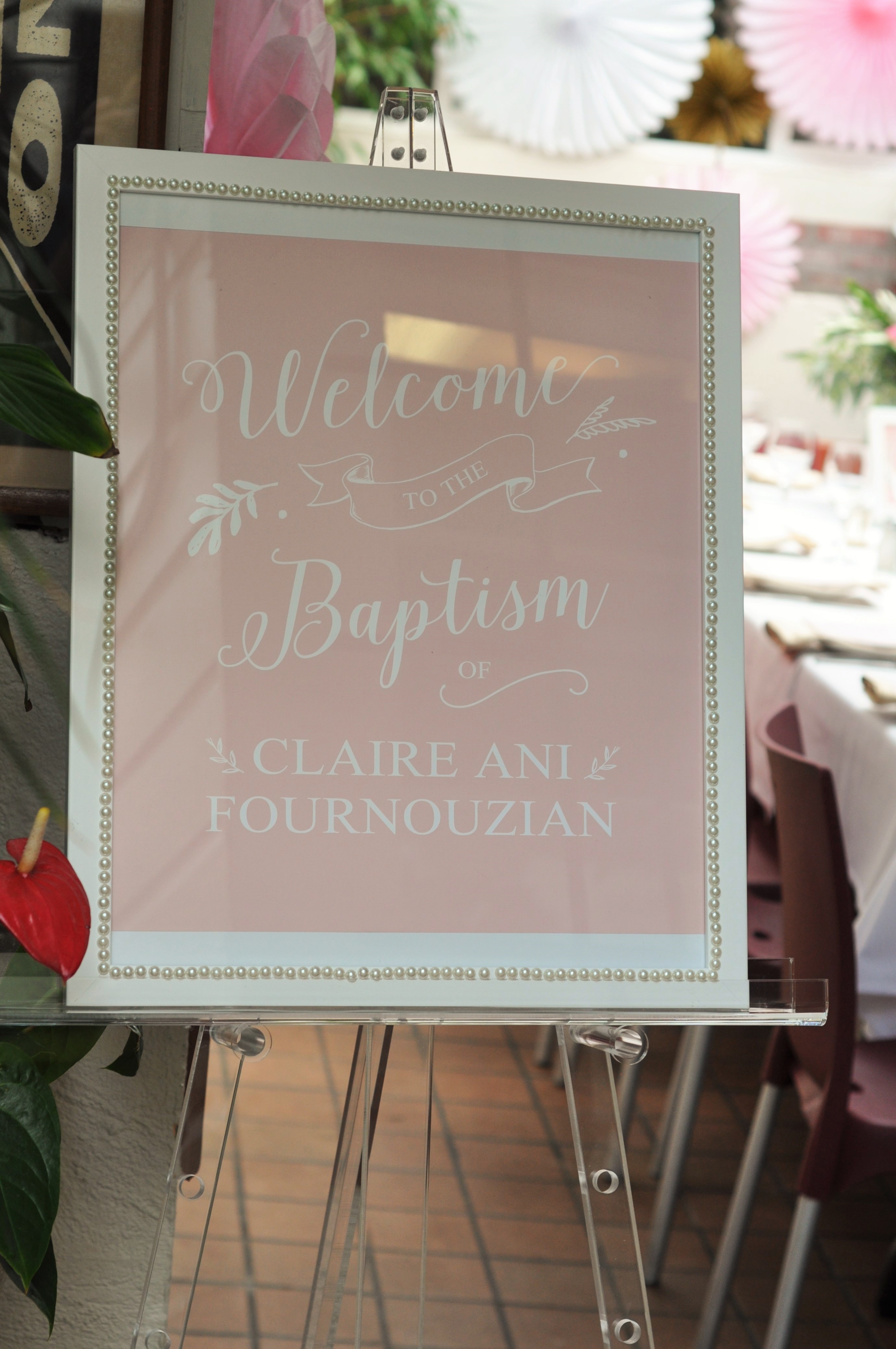
I used a large welcome sign. Show your guests what to expect as soon as they arrive and guide them to where they should be.
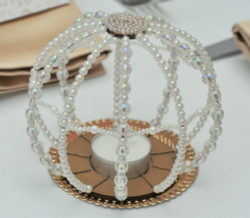
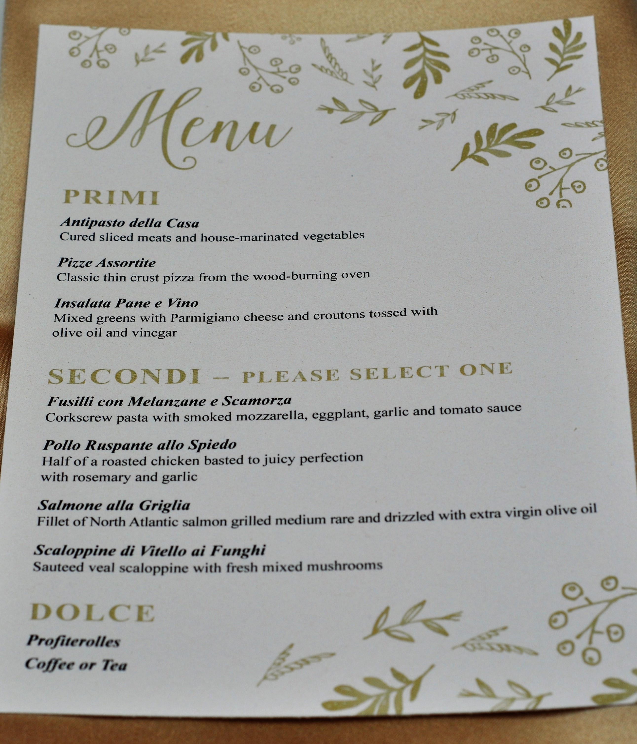
The restaurant offered plain white linens which we used (more cost effective) and invested only in hiring the gold napkins. With a menu card placed on top this bought the theme to the tabletop and gave an elegant look. Simple candles in both gold and pearl holders and floral centerpieces completed the table setting.
Due to time constraints we used existing furniture provided by the restaurant for both the dessert and favor tables. I invested in a single beautiful gold rosette linen. This worked perfectly to glamourise the table, a simple pink backdrop behind it and the cake and it was as eye-catching as I needed it to be.
Unfortunately time, space and budget prevented changing out chairs but we were able to add simple yet fabulous decor around the restaurant walls to draw the eyes.
I added large fans around restaurant patio. They are very easy to put up, cost effective and provide good coverage for areas you might find don’t fit with your theme in the venue or restaurant. I used pretty pinks and whites with small gold accent fans that looked like flower blooms. They could also be removed quickly if, as we did, for the next sitting after the party.
Creating a pretty theme in the back of a restaurant that has its own strong identity, in this case a very red and very italian covered back garden, can seem overwhelming. Especially if you don’t have a large budget. It is possible!
I hope these tips help. Don’t feel you need to decorate every inch of the venue and line of sight. Focus efforts on key areas – dessert table, graphics and florals – and use small thoughtful touches e.g. pearls to pull in the theme and catch your guests attention. These are the things your guests will remember. That and your company of course!
Vendor Credits:
- Cake – @redflourco
- Graphic Design – @plumboxpress
- Florals – Bloomin Couture
- Cookies & Macaroons – Roni’s Sugar Creations
- Cake pops – Let them eat pops
- Photography – Kevork Demirjian





Leave a Reply